
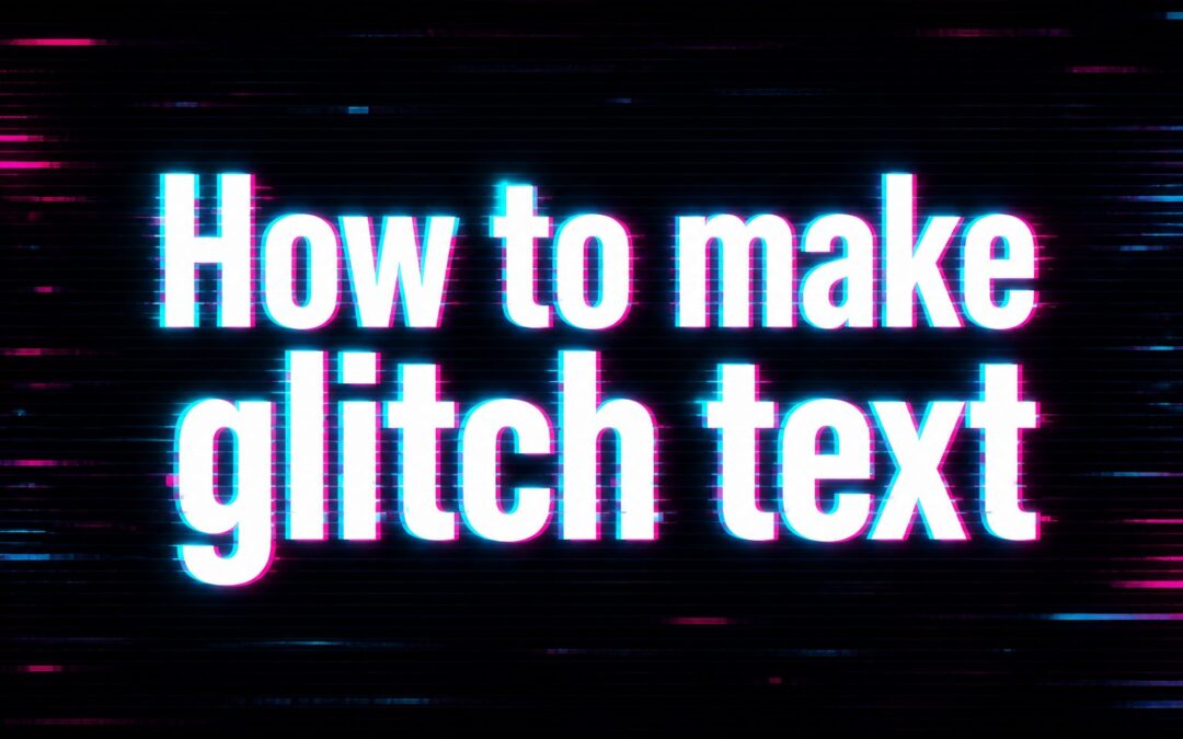
Learning how to make glitch text is useful when you want typography that feels digital, edgy, and visually striking. Glitch text mimics the look of a screen error, signal distortion, or broken data effect, which is why it appears so often in gaming graphics, music visuals, social posts, posters, and modern web design. It can make a simple word or phrase feel more energetic and memorable without needing a complex design system. The good news is that you do not need advanced software skills to create it. You can build glitch text with simple layering, color shifts, distortion, animation, or text generators, depending on where you plan to use it. In this guide, you will learn what glitch text means, why people use it, how the effect works, practical ways to create it, where it fits best, common mistakes to avoid, and expert tips for making the final result look intentional rather than messy.
What Glitch Text Means
Glitch text is a typographic style that looks intentionally distorted. It often includes broken letter shapes, duplicated layers, offset colors, jittered movement, horizontal cuts, or digital noise. The effect is inspired by malfunctioning screens, corrupted video signals, old television interference, and computer display errors.
In practice, glitch text is less about making words unreadable and more about adding controlled disruption. A designer keeps the original text recognizable, then adds visual flaws that create tension, motion, and personality. That balance is what makes the style appealing. If the distortion is too light, the text looks ordinary. If it is too heavy, the message becomes difficult to read.
Why Glitch Text Is Popular
Glitch text has become popular because it creates impact quickly. A plain headline can look bold and modern once it gets a carefully built distortion effect. It works especially well in digital environments where people scroll fast and react to visual contrast.
- Strong Visual Identity: Glitch styling gives text a distinct look that stands out from standard clean typography.
- Modern Digital Feel: It connects naturally with gaming, tech, cyber themes, streaming, and futuristic branding.
- Built In Motion: Even static glitch text feels active because the distortion suggests movement and instability.
- Flexible Style Range: The effect can look subtle, artistic, chaotic, retro, or high energy depending on execution.
- Useful Across Platforms: It works in websites, video intros, posters, album art, event graphics, and social media content.
- Memorable Presentation: Words with a glitch effect often stay in the viewer’s mind longer than plain text alone.
How Glitch Text Works
The effect works by interrupting visual consistency. Normal text is clean, aligned, and stable. Glitch text breaks one or more of those qualities in a controlled way. That disruption makes the viewer feel like the text is flickering, shifting, or momentarily failing on screen.
Layer Offsets
One of the most common methods is duplicating the same text and moving each copy slightly. A main layer stays centered while red, cyan, blue, or magenta copies shift left, right, up, or down. This creates the familiar digital color split seen in many glitch designs.
Horizontal Slices
Another popular technique is cutting the text into strips and moving a few slices out of alignment. When thin horizontal segments slide in different directions, the word appears broken like a damaged signal. This method creates a very recognizable screen glitch look without requiring heavy effects.
Noise And Flicker
Small bursts of grain, blur, scan lines, or opacity changes add realism. In motion design, a slight flicker can make the text feel alive. In static graphics, subtle texture helps prevent the design from looking too clean or artificial.
Benefits Of Using Glitch Text
Glitch text is not appropriate for every project, but when used well it offers clear creative benefits. It gives text more personality, helps direct attention, and supports themes that would feel flat with standard lettering.
It adds mood fast. If you want a cyber, futuristic, underground, or experimental tone, glitch typography can communicate that in seconds.
It increases contrast. On a feed full of simple type layouts, a glitched word or phrase can pull the eye more effectively than a basic font treatment.
It supports storytelling. Themes like technology, disruption, speed, data, gaming, hacking, nightlife, and digital culture all pair naturally with this style.
It works for both static and animated design. You can keep it minimal in a poster or make it dynamic in video, streaming overlays, and web interactions.
How To Make Glitch Text Step By Step
If you want a reliable process, it helps to build the effect in layers. The goal is to start with readable typography and then add distortion gradually so the design stays controlled.
- Choose A Bold Font: Start with a typeface that has clear letterforms. Sans serif fonts with strong shapes usually work best because the distortion stays visible without making the word confusing.
- Set Your Base Text: Create the text in a solid color with strong contrast against the background. This base layer should remain readable because it anchors the effect.
- Duplicate The Text: Make two or three copies of the word. These duplicate layers will be used for color shifts, slices, or blur.
- Apply Color Separation: Change duplicate layers to accent colors such as cyan, red, blue, or magenta. Move them slightly off center to create a digital split effect.
- Add Slice Distortion: Break parts of the word into narrow horizontal segments and nudge some sections left or right. Do this lightly at first so the layout stays legible.
- Introduce Noise Or Blur: Add texture, grain, flicker, or a mild blur to selected areas. This helps the text feel electronic rather than simply misaligned.
- Check Readability: Step back and confirm that the text still says what it should. If viewers must struggle to read it, reduce the distortion.
- Adjust For The Final Platform: A poster, website banner, social graphic, and video title all need different intensity levels. Refine the effect based on screen size and viewing distance.
Tools You Can Use To Create Glitch Text
You can make glitch text with many tools, from professional design software to simple online editors. The best option depends on how much control you need and whether the final result will be static or animated.
Graphic Design Software
Programs used for image editing or layout design give you the most control. They let you duplicate text layers, mask slices, adjust blend effects, and refine colors precisely. This is usually the best route for posters, thumbnails, covers, and branding visuals where detail matters.
Video And Motion Tools
If you want animated glitch text, motion design tools are often the better fit. They allow you to keyframe movement, flicker, scan lines, and fast distortion bursts. This works especially well for intros, music visuals, trailers, and social clips.
Website Builders And CSS Effects
For web projects, glitch text can be created with layered text elements and animation effects. This approach is useful for hero banners, tech brand pages, launch screens, and interactive campaigns. The main rule is to keep performance and readability in mind, especially on mobile devices.
Best Styles And Design Choices
Not every glitch text design should look chaotic. The strongest results come from matching the effect to the message, audience, and visual setting.
- Use Bold Short Words: Single words, names, and short headlines usually work better than long paragraphs because the distortion stays easier to read.
- Choose High Contrast Colors: A dark background with bright accent shifts often creates the clearest and most dramatic result.
- Limit Accent Colors: Two or three supporting colors are usually enough. Too many hues can make the design look random rather than deliberate.
- Control The Distortion: Move only selected slices or layers instead of disrupting every part of the text equally.
- Match The Brand Mood: A luxury brand, children’s event, and cyber gaming stream should not use the same glitch treatment.
- Preserve Readability: The effect should enhance the message, not hide it.
Practical Use Cases For Glitch Text
Glitch text works best when the project benefits from tension, movement, or a digital edge. It can feel artistic, rebellious, futuristic, or energetic depending on the surrounding design.
Social Media Graphics
Glitch text is useful for attention grabbing headlines, launches, and promo visuals on social platforms. A bold word with subtle distortion can stop the scroll more effectively than standard text, especially in music, gaming, fashion, and creative niche content.
Posters And Event Visuals
Concert posters, nightlife flyers, esports promotions, and digital art events often benefit from glitch typography because it adds atmosphere without needing complex illustration. It can turn a simple title into the main visual hook of the piece.
Web Hero Sections
On websites, glitch text can create a memorable first impression when used in moderation. It is especially effective in hero banners for creative studios, digital products, gaming brands, or tech campaigns. The key is to keep the animation light enough that users can still read the headline immediately.
Video Titles And Stream Assets
For video intros, trailers, music edits, and streaming overlays, animated glitch text adds motion and energy. Fast flickers, slice jumps, and color shifts can create a polished digital feel when timed carefully with sound or transitions.
Best Practices When Making Glitch Text
A good glitch effect feels intentional. A weak one looks like random damage. These best practices help keep the design clean, useful, and visually strong.
Start simple. Build a readable version first, then add distortion gradually. This prevents the effect from becoming uncontrolled too early.
Use the effect selectively. Glitch text is strongest on titles, pull quotes, logos, and short phrases. Large blocks of body text rarely benefit from it.
Keep one stable layer. Even if duplicates shift around, one version of the text should stay mostly grounded to hold legibility.
Test on different screens. What looks balanced on a desktop monitor may look blurry or cramped on a phone screen.
Match effect intensity to purpose. A brand headline may need subtle distortion, while a music poster can handle something more aggressive.
Common Mistakes To Avoid
Many glitch text designs fail because the creator focuses only on the effect and forgets the message. The most common problems are easy to fix once you know what to watch for.
- Making The Text Too Hard To Read: Heavy slicing, extreme blur, or too many duplicates can bury the original word. Keep the message clear first.
- Overusing Bright Colors: Neon accents are effective, but too many competing colors can make the piece feel noisy and cheap.
- Applying The Effect To Long Sentences: Glitch text works best in short headlines. Large paragraphs with distortion become tiring to read.
- Ignoring The Background: Busy backgrounds can clash with the effect and reduce contrast. Give the text enough visual space.
- Using Random Distortion: If every part of the word breaks equally, the design loses structure. Controlled imbalance looks more professional.
- Forgetting The Audience: A glitch effect that suits a gaming promo may look out of place on a formal business layout.
Expert Tips For Better Results
Once you know the basics, a few advanced choices can make the result look far more polished. These are small adjustments, but they create a noticeable difference.
Use Imperfection With Restraint
The strongest glitch designs usually distort only part of the text. For example, you might leave most letters stable and break just a few slices near the top or middle. That selective damage feels more believable and keeps the composition easier to read.
Combine Sharp And Soft Areas
If every layer is equally crisp, the design can feel flat. Try mixing sharp letter edges with a few blurred offsets or textured fragments. The contrast between precision and breakdown gives the text more depth and makes the effect feel intentional.
Think About Timing In Motion Design
For animated glitch text, constant movement is often weaker than quick, irregular bursts. Short interruptions feel more like real signal distortion. Brief jumps followed by stillness usually look more professional than nonstop flickering, which can distract the viewer.
Examples Of Glitch Text Ideas
If you are not sure how to apply the style, these examples show how glitch text can fit different creative directions without looking repetitive.
- Music Poster Headline: A band name in white with cyan and red offsets on a dark textured background.
- Gaming Stream Title: A short channel name with horizontal slice jumps and a subtle animated flicker.
- Tech Product Launch Graphic: A clean sans serif headline with minimal digital interference around selected letters.
- Fashion Campaign Wordmark: A high contrast black and silver design with restrained distortion for an editorial feel.
- Video Intro Text: A bold title that appears clean first, then glitches for a split second before settling.
- Cyber Event Flyer: Layered text with scan line texture and narrow offset shadows for a futuristic tone.
Frequently Asked Questions
1. What Is Glitch Text?
Glitch text is typography that is intentionally distorted to look like a digital error, broken signal, or screen malfunction. It often uses offset color layers, sliced letter sections, blur, or flicker. The goal is to create a bold visual effect while keeping the word readable enough for the audience to understand.
2. Do I Need Professional Software To Make Glitch Text?
No, professional software helps, but it is not the only option. You can create glitch text with many basic design tools, online editors, or website styling methods. Advanced programs offer more control over layers and motion, but simple versions of the effect are possible with beginner friendly tools as well.
3. What Fonts Work Best For Glitch Text?
Bold, clean fonts usually work best because the effect stays visible without losing readability. Sans serif fonts are a common choice, especially for modern digital styles. Thin, decorative, or highly detailed fonts can become hard to read once you add slicing, shifting, and color separation to the letters.
4. Can Glitch Text Be Used On Websites?
Yes, glitch text can work very well on websites, especially in banners, hero sections, and promotional headings. The main concern is usability. The effect should load smoothly, stay readable on mobile screens, and avoid constant aggressive animation that distracts users or makes the page feel difficult to navigate.
5. How Do I Make Glitch Text Look More Professional?
Keep the design controlled. Use a clear base layer, limit accent colors, distort only selected sections, and test the result at the size where people will actually view it. Professional glitch text usually feels deliberate and balanced, while amateur versions often rely on too many random effects at once.
6. Is Glitch Text Good For Every Project?
No, it is best for projects that benefit from a digital, futuristic, artistic, or high energy mood. It fits gaming, music, tech, nightlife, and experimental branding especially well. For formal, traditional, or highly informational content, a glitch effect can feel distracting or out of place if used too heavily.
Conclusion
Learning how to make glitch text comes down to one core principle: start with readable typography, then add controlled distortion to create energy and style. Layer offsets, slice effects, noise, flicker, and color separation all help create the look, but the best results always keep the message clear enough to understand.
Whether you are designing for social media, posters, websites, or video, glitch text can give your work a sharper digital personality when used with restraint. Focus on contrast, balance, and purpose, and the effect will look intentional rather than chaotic.