
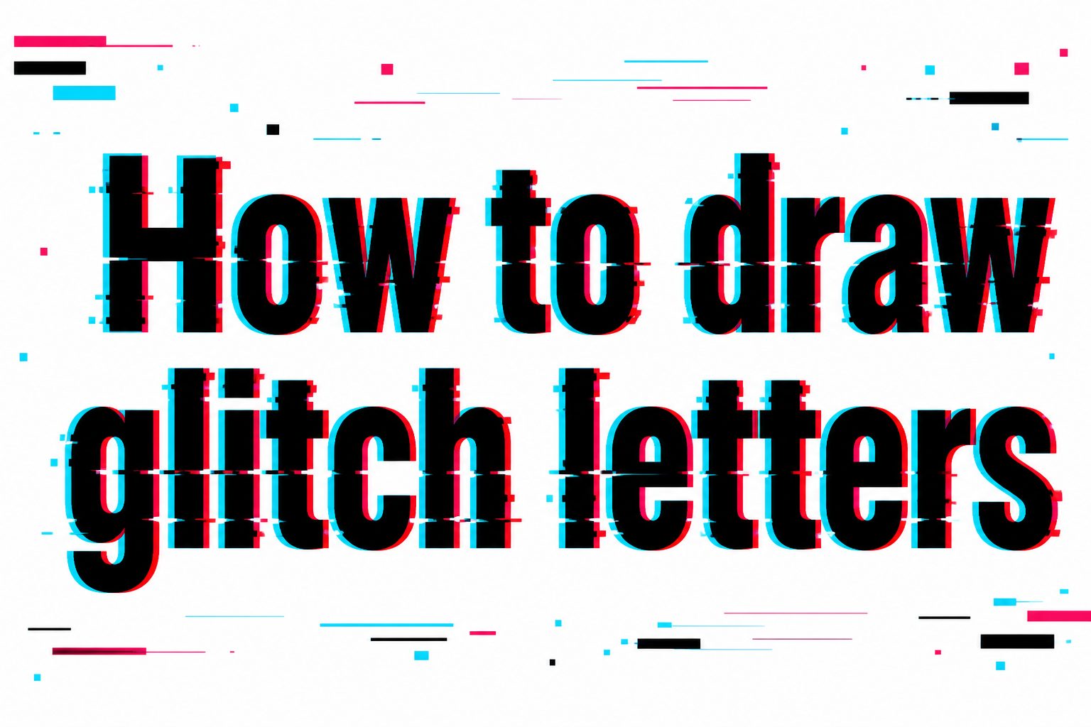
How to draw glitch letters is a useful skill for anyone who wants to create bold, digital-looking lettering by hand, whether for posters, sketchbook pages, logos, stickers, thumbnails, murals, or social media artwork. Glitch lettering takes normal letters and makes them look as if they have been distorted by a screen error, signal break, broken file, or digital interference. The style often includes sliced shapes, shifted outlines, jagged edges, color offsets, broken strokes, scan lines, pixel blocks, and small visual interruptions. The best part is that you do not need advanced drawing tools to start. With a pencil, eraser, ruler, marker, and a few simple techniques, you can turn ordinary block letters into energetic glitch art. In this guide, you will learn what glitch letters mean, why the style works, how to build the effect step by step, what mistakes to avoid, and how to make your lettering look clean, intentional, and visually exciting.
What Glitch Letters Mean
Glitch letters are letters designed to look digitally damaged, interrupted, or visually displaced. The style comes from the look of broken screens, corrupted videos, old television static, low-resolution graphics, and computer errors. Instead of drawing letters as smooth, perfect shapes, you deliberately add visual breaks that make the lettering feel unstable and modern.
The key idea is controlled distortion. A good glitch letter should still be readable, but it should also look like parts of it have slipped, duplicated, stretched, or fragmented. This balance between clarity and chaos is what makes glitch typography so interesting. If the letter is too clean, it does not feel glitched. If it is too broken, the viewer cannot read it.
Glitch lettering can be sharp and futuristic, rough and rebellious, or colorful and playful. It works especially well with block letters, bold sans serif letters, graffiti-inspired forms, cyberpunk themes, gaming graphics, music posters, and digital art layouts.
Why Glitch Lettering Is Popular
Glitch lettering is popular because it immediately suggests energy, technology, disruption, and movement. It looks modern without needing complex illustration, and it can turn a simple word into a strong visual statement. Artists use it when they want text to feel edgy, digital, intense, or experimental.
The style also gives beginners a lot of creative freedom. You do not need perfectly smooth lines, because small breaks and offsets can actually improve the effect. At the same time, glitch letters reward careful planning. The most impressive results usually come from clean base lettering combined with deliberate distortion.
- Visual Impact: Glitch effects make plain letters look more dynamic and eye-catching.
- Creative Flexibility: You can make the effect subtle, messy, colorful, futuristic, or hand-drawn.
- Beginner Friendly: Simple slices, offsets, and broken lines can create a strong result quickly.
- Modern Style: The look connects naturally with gaming, technology, music, streetwear, and digital culture.
- Personal Expression: Every artist can distort the same word differently, so the result feels original.
How Glitch Letters Work
Glitch letters work by interrupting the viewer’s expectation of a normal letterform. A letter usually has a stable outline, consistent spacing, and clear edges. A glitch effect changes that stability by shifting parts of the letter, duplicating edges, breaking strokes, or adding graphic noise around the form.
Distortion Creates Motion
When part of a letter is moved slightly left, right, up, or down, the eye reads it as movement. This is why horizontal slices are so common in glitch art. A small section of the letter might slide out of alignment while the rest stays in place, creating the feeling of a digital signal slipping for a moment.
Repetition Creates A Digital Echo
Duplicated outlines make glitch letters look as if the image has split into layers. You might draw a second outline slightly to the left of the original or add a colored shadow on one side. This creates a screen-like echo that feels similar to color separation, video distortion, or misaligned digital channels.
Breaks Create Texture
Small missing pieces, pixel blocks, scan lines, and jagged marks give the letter texture. These details should not be random scribbles. They work best when they follow the structure of the letter and support the direction of the glitch effect. A few well-placed breaks often look better than covering the whole word with noise.
Best Supplies For Drawing Glitch Letters
You can draw glitch letters with very simple materials. The main goal is to sketch lightly first, then build clean edges and controlled distortions. Digital tools can help, but they are not required. A hand-drawn glitch style often has more personality because the small imperfections feel intentional and expressive.
- Pencil: Use it to sketch your base letters, slice lines, and offset areas before committing with ink.
- Eraser: A clean eraser helps remove construction lines after the final outline is complete.
- Ruler: Straight edges are useful for block letters, horizontal slices, scan lines, and pixel sections.
- Black Marker: A bold marker makes the main letterform strong enough to handle distortion.
- Colored Markers: Red, cyan, blue, magenta, green, or yellow can create a strong digital offset effect.
- Fine Liner: Thin pens are useful for small cracks, texture marks, and detailed broken edges.
How To Draw Glitch Letters Step By Step
The easiest way to learn glitch lettering is to start with a simple word in bold block letters. Once the base word is readable, you can add distortion in layers. Do not begin with the glitch details first. The stronger your base letter structure is, the better the final effect will look.
- Choose A Short Word: Start with a word of three to six letters, such as vibe, static, error, neon, or chaos. Short words are easier to control while you learn the effect.
- Sketch Basic Block Letters: Draw large letters with enough thickness for slices and details. Keep the spacing even, and make sure the word is easy to read before adding distortion.
- Add Horizontal Slice Lines: Lightly draw two or three horizontal bands through the letters. These bands will become the areas that shift or break away from the original form.
- Shift Selected Sections: Move parts of the letters slightly left or right inside the slice bands. Keep the movement small so the word stays readable.
- Break Some Edges: Remove or interrupt small pieces of the outline. Add jagged corners, missing chunks, or short separated strokes where the glitch effect feels natural.
- Add Offset Outlines: Draw a second outline slightly away from the main letter. Use it sparingly around one side, not around every edge.
- Build Pixel Details: Add small squares, rectangles, or short bars near the broken areas. These should look like digital fragments escaping from the letters.
- Ink The Main Shape: Go over the strongest parts of the letters with marker or pen. Keep the main body bold so the distortion does not overpower readability.
- Clean And Finish: Erase sketch lines, add color accents if desired, and check the word from a distance to make sure it still reads clearly.
Choosing The Right Letter Style
The base lettering style has a major effect on the final result. Glitch effects can be applied to many kinds of letters, but some styles are easier to control than others. Beginners usually get the best results with bold, simple letterforms because there is more room to cut, shift, and add texture.
Block Letters
Block letters are the best starting point because their thick strokes can hold strong glitch details. You can slice through them, shift sections, add shadows, and create pixel breaks without losing the basic shape. Keep the letters simple at first, then add sharper angles once you are comfortable.
Bubble Letters
Bubble letters create a softer glitch effect. The contrast between round shapes and sharp digital breaks can look interesting, especially for playful designs. However, the curves can be harder to slice cleanly, so use fewer distortions and focus on offset outlines or small broken marks.
Graffiti Letters
Graffiti-style glitch letters can look powerful because both styles use energy, distortion, and personal expression. The challenge is readability. If the base graffiti letters are already complex, add only selective glitch details. Too many arrows, shadows, cracks, and offsets can make the design hard to understand.
Glitch Effects You Can Add
Once you have a solid base word, you can choose the type of glitch effect that fits your design. You do not need to use every effect at once. In fact, most strong glitch lettering uses two or three techniques consistently rather than filling the entire page with every possible detail.
- Horizontal Slices: Cut through the letter with thin bands and shift those bands slightly to create a screen-tear effect.
- Offset Shadows: Add a second outline in red, cyan, blue, or black to suggest digital color separation.
- Pixel Blocks: Draw small square or rectangular fragments near the edges of the letters.
- Broken Strokes: Leave small gaps in the outline or body of the letter to make it feel corrupted.
- Scan Lines: Add thin horizontal lines across or behind the word for a screen-inspired texture.
- Jagged Extensions: Pull small parts of the letter outward with sharp angles to create tension and motion.
Color Ideas For Glitch Letters
Color can make glitch letters look much more digital, but it should be used with control. The classic approach is to use a strong black letter with red and cyan offsets. This creates the feeling of misaligned screen channels. You can also use neon green, electric blue, hot pink, or yellow for a more futuristic style.
If you want a clean look, keep the main letter black or dark gray and use color only on shifted outlines or small fragments. If you want a louder poster style, fill the letters with bright color and use black for broken shadows. The important thing is contrast. The viewer should be able to separate the main letter from the glitch effects.
Simple Color Formula: Draw the main word in black, add a cyan offset on the left edge, add a red offset on the right edge, and place a few matching pixel fragments near the sliced areas. This gives you a strong glitch style without making the drawing feel crowded.
Question Ideas Before You Start Drawing
Before you draw, asking yourself a few simple design questions can help you avoid a messy result. Glitch lettering looks spontaneous, but the best versions usually have a clear plan behind them. These questions help you decide the mood, layout, readability, and amount of distortion before you commit to ink.
- What Word Should I Use: Choose a word that fits the mood, such as error, dream, static, neon, cyber, broken, or future.
- How Readable Should It Be: Decide whether the word needs to be instantly readable or more experimental.
- What Direction Is The Glitch Moving: Most glitch effects look stronger when the distortion moves mainly left, right, or horizontally.
- How Much Color Do I Want: Pick a limited palette before drawing so the finished word feels intentional.
- Where Will The Design Be Used: A sketchbook piece can be detailed, while a poster or logo needs clearer shapes from a distance.
Examples Of Glitch Letter Ideas
Examples can help you practice without staring at a blank page. Start with one word and one main effect, then repeat the same idea with small changes. This helps you understand what makes a glitch letter look convincing instead of random.
Static: Draw the word in tall block letters, then add thin horizontal scan lines through the middle. Shift two narrow sections of each letter slightly to the right and add small rectangular fragments around the edges.
Error: Use sharp, angular letters and break the outlines in several places. Add a red offset outline on one side and a blue offset on the other. Keep the center of each letter clear so the word stays readable.
Neon: Draw rounded block letters and use bright color accents around the edges. Add small pixel blocks that look like glowing fragments. This approach works well for posters, digital art, and music-themed designs.
Cyber: Use narrow futuristic letters with straight edges. Add short bars, broken corners, and small repeating rectangles. Keep the design clean and structured so it feels technological rather than messy.
Practical Uses For Glitch Lettering
Glitch lettering can be used in many creative projects because it brings instant attitude and visual energy. It is especially useful when the theme involves technology, music, gaming, motion, rebellion, or futuristic design. Even a single glitch word can become the main focus of a composition.
- Poster Design: Use glitch letters for event posters, band posters, gaming nights, film screenings, or technology-themed announcements.
- Sketchbook Practice: Practice one word at a time to explore letter structure, distortion, and hand control.
- Logo Concepts: Create rough ideas for brands, teams, channels, or creative projects that need a digital edge.
- Social Media Graphics: Glitch words work well in headers, thumbnails, profile art, and short visual posts.
- School Art Projects: The style is easy to explain and visually strong, making it useful for typography assignments.
- Stickers And Merch: Short glitch words or initials can translate well into sticker designs, patches, shirts, and notebook covers.
Best Practices For Clean Glitch Letters
Clean glitch lettering depends on restraint. The effect should support the word, not bury it. A common beginner mistake is adding too many breaks, lines, shadows, and fragments until the letters become unreadable. Strong glitch design usually has a clear main shape with controlled distortion around it.
Keep your base letters consistent in height, width, and spacing. Even if parts of the word are broken, the original structure should still be visible. Use a ruler when you want a digital, precise look, and use freehand marks when you want the design to feel rougher or more expressive.
Protect Readability: Step back from the drawing every few minutes. If you cannot read the word quickly, simplify the effects. Remove extra fragments, strengthen the main outline, or reduce the number of sliced sections.
Repeat Visual Rules: Choose a few repeated details, such as horizontal slices and cyan offsets, then use them throughout the word. Repetition makes the design feel intentional instead of accidental.
Common Mistakes To Avoid
Glitch letters are forgiving, but they can become confusing if the distortion is not controlled. The goal is not to make the word look messy. The goal is to make it look like a designed error. Avoiding a few common mistakes will make your lettering cleaner and more professional.
- Making Every Letter Too Broken: Leave some areas clean so the viewer can still recognize the word.
- Using Random Lines Everywhere: Place lines where they support motion, slicing, or screen texture.
- Forgetting The Base Shape: Start with strong letters before adding effects. Weak base lettering leads to weak glitch lettering.
- Adding Too Many Colors: Limit your palette so the offsets look digital rather than chaotic.
- Ignoring Spacing: Keep letters evenly spaced, even when parts of them shift or stretch.
- Overdoing Tiny Details: Small fragments work best when they are used as accents, not as clutter across the whole page.
Advanced Tips For Better Glitch Art
Once you are comfortable with the basic process, you can make glitch lettering more polished by thinking like a designer. Instead of adding effects wherever they fit, decide how the viewer’s eye should move across the word. You can create rhythm by placing larger distortions in a few key areas and smaller details around them.
Use Contrast Between Stable And Broken Areas
A glitch effect looks stronger when it is compared against something stable. Keep some letters or sections clean, then heavily distort one part of the word. This contrast makes the broken area feel more dramatic and prevents the entire design from becoming visually tiring.
Layer Effects Gradually
Build the effect in stages rather than adding everything at once. Start with sliced sections, then add offset outlines, then add small fragments. After each stage, check readability. This process gives you more control and helps you stop before the drawing becomes overcrowded.
Match The Effect To The Word
The best glitch lettering choices support the meaning of the word. A word like static might use many thin scan lines, while a word like broken might use separated chunks and cracked edges. When the effect and meaning work together, the lettering feels more thoughtful and memorable.
Final Drawing Checklist
Before you call your glitch lettering finished, take a moment to review the drawing. A quick checklist helps you catch small issues while they are still easy to fix. This is especially helpful if the design will be scanned, posted online, printed, or used in a larger project.
- Base Word Is Readable: The viewer can understand the word without needing to study it for too long.
- Distortion Has Direction: The shifts, slices, and fragments feel like they belong to the same visual system.
- Color Is Controlled: The palette supports the glitch effect without overpowering the main letters.
- Spacing Looks Balanced: The letters sit together as one word, even with shifted sections.
- Details Are Not Crowded: Empty space remains around the strongest effects so the design can breathe.
- Final Lines Are Clean: Construction marks are erased, and the main outlines are confident enough to hold the design.
Frequently Asked Questions
What Are Glitch Letters?
Glitch letters are letters drawn to look digitally distorted, broken, shifted, or interrupted. They are inspired by screen errors, video static, corrupted files, and digital signal problems. The style keeps the word readable while adding sliced sections, offset outlines, broken edges, pixel blocks, and other visual effects.
What Is The Easiest Way To Draw Glitch Letters?
The easiest method is to draw simple block letters first, then add a few horizontal slice lines. Shift selected sections slightly left or right, break small parts of the outline, and add one or two offset colors. Starting with a clean base word makes the final glitch effect much easier to control.
Do I Need Special Tools To Draw Glitch Lettering?
No special tools are required. A pencil, eraser, ruler, black marker, and one or two colored markers are enough for most hand-drawn glitch letters. Digital drawing apps can make layers and color offsets easier, but the core techniques work just as well on paper.
Which Letters Work Best For Glitch Effects?
Bold block letters usually work best, especially for beginners. Thick strokes give you room to add slices, missing pieces, shadows, and pixel details. Thin script or highly decorative letters can still be glitched, but they are harder to distort without losing readability.
How Do I Keep Glitch Letters Readable?
Keep the main letter shape strong and avoid breaking every part of the word. Add distortion to selected areas instead of covering the entire design. If the word becomes hard to read, reduce the number of fragments, strengthen the outline, and leave more clean space inside the letters.
What Colors Are Best For Glitch Lettering?
Black with red and cyan offsets is a classic glitch color combination because it suggests digital color separation. Blue, magenta, green, yellow, and white can also work well. For the cleanest result, use one dark main color and one or two accent colors for the shifted details.
Can Glitch Letters Be Used In Logos Or Posters?
Yes, glitch lettering can work well for logos, posters, thumbnails, stickers, and event graphics, especially when the theme is digital, futuristic, gaming, music, or technology-related. For practical design use, keep the word clear from a distance and avoid tiny details that disappear when printed or resized.
Conclusion
Learning how to draw glitch letters starts with a simple idea: create strong, readable letters, then interrupt them with controlled distortion. Slices, offsets, broken strokes, scan lines, pixel blocks, and color separation can all make ordinary lettering feel digital, energetic, and modern when they are used with purpose.
Start with short words, bold block letters, and a limited set of effects. As you improve, experiment with color, texture, spacing, and more advanced layering. The best glitch lettering looks expressive without becoming unreadable, so keep checking the balance between clean structure and creative disruption.