
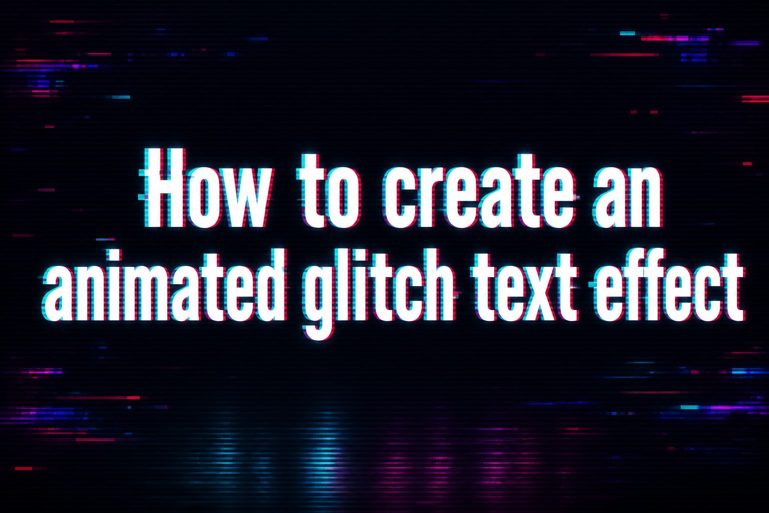
Learning how to create an animated glitch text effect is a useful way to give ordinary typography a digital, distorted, and energetic appearance. Glitch text can make a website header, logo, social media graphic, video title, gaming interface, or creative project feel more dynamic without requiring a complicated animation. The effect usually combines duplicated text layers, rapid movement, color separation, clipping, distortion, and carefully timed changes to create the appearance of a screen malfunction. The best results are usually controlled rather than completely random, because the text still needs to remain readable. In this guide, you will learn what an animated glitch text effect is, why designers use it, how the effect works, several practical ways to create it, and how to control the animation with CSS. You will also find design examples, use cases, common mistakes, best practices, and answers to frequently asked questions.
What Is An Animated Glitch Text Effect
An animated glitch text effect is a typography animation that makes text appear to flicker, shift, break apart, duplicate, or change color for short periods. It is inspired by visual errors associated with damaged video signals, digital displays, corrupted files, and electronic screens. Instead of leaving the text static, the animation changes parts of the lettering over time.
A typical glitch effect uses the original text as the main layer and creates additional versions of the same text. These copies can move by a few pixels, display different colors, or show only selected portions of the letters. When the layers change quickly, the eye interprets them as one distorted digital signal.
The effect can be subtle or dramatic. A small horizontal shift may create a professional digital feel, while stronger clipping, flickering, and color separation can produce a futuristic or cyber-inspired appearance. The right level depends on the purpose of the design.
Why Use Glitch Text Animation
Glitch animation can attract attention because movement naturally stands out from static content. It is especially useful when a design needs a technical, gaming, futuristic, experimental, or digital personality.
- Creates visual interest: A small amount of movement can make an otherwise simple heading more noticeable.
- Supports digital themes: Glitch typography fits websites, interfaces, games, videos, and graphics with a technology-focused style.
- Works with simple text: You can create an impressive effect without replacing ordinary typography with an elaborate graphic.
- Adds personality: A controlled distortion can make branding feel more distinctive and memorable.
- Can be lightweight: CSS-based effects can often be created without large animation libraries or video files.
- Offers flexible control: Speed, intensity, colors, movement, and timing can all be adjusted to suit the design.
How A Glitch Text Effect Works
Although a finished glitch animation can look complicated, the underlying idea is fairly simple. The browser displays text and applies visual changes to it over time. Several CSS techniques can work together to produce the final appearance.
Text Duplication
One common approach is to create duplicate versions of the text. The main text remains visible while additional layers are positioned in the same area. Each duplicate can use a different color or movement pattern. When these layers overlap imperfectly, they create the characteristic split-screen appearance associated with glitch typography.
Color Separation
Red, cyan, blue, magenta, or other contrasting colors can be placed slightly away from the primary text. This creates a chromatic separation effect similar to an old display losing alignment. The offset should normally remain small because excessive separation can make the letters difficult to read.
Clipping And Slicing
Another important technique is showing only a portion of a duplicated text layer. CSS clipping or masking can make one horizontal section move independently from another. A few short slices that shift for a fraction of a second can make the text appear corrupted without permanently changing its shape.
Rapid Movement
Glitch effects often rely on short movements rather than large transitions. A layer might move a few pixels left, right, upward, or downward and then immediately return. The quick change creates visual instability while keeping the overall typography recognizable.
How To Create An Animated Glitch Text Effect With CSS
CSS is one of the easiest ways to create a reusable animated glitch text effect for a website. The basic concept is to use the original text plus pseudo-elements such as ::before and ::after. The duplicate layers can inherit the same text and then receive different colors, positions, and clipping behavior.
- Choose a suitable font: Start with a bold or medium-weight typeface that remains readable when parts of the letters move. Very thin fonts can become difficult to read during distortion.
- Create the main text: Place the heading or word inside an element that can be positioned relative to its surrounding content.
- Add duplicate layers: Use pseudo-elements to reproduce the same text over the original layer. These copies will become the visual glitch layers.
- Separate the colors: Give the duplicate layers contrasting colors and position them slightly away from the main text.
- Add clipping: Use clipping techniques to reveal different horizontal portions of the duplicate layers.
- Create keyframes: Define several points in the animation where the layers move, disappear, shift, or return to their normal position.
- Adjust the animation timing: Use a short duration and carefully chosen timing to create quick distortion instead of a slow transition.
- Test readability: View the effect on different screen sizes and make sure the text remains understandable.
The most important part is not simply adding movement. A convincing glitch effect uses irregular changes. If every layer moves continuously at the same speed, the result can look more like a standard text animation. Short periods of stability followed by brief bursts of distortion usually feel more authentic.
Choosing The Right Glitch Style
There is no single correct way to create glitch typography. The style should match the design around it. A website for a software product may benefit from a restrained effect, while a gaming landing page or music visual can support a much more aggressive treatment.
Minimal glitch: Use tiny offsets, subtle color separation, and occasional flickering. This approach works well for headings where readability is the main priority.
Cyber glitch: Combine bright contrasting colors, horizontal slices, rapid shifts, and short flickers. This style works particularly well with dark interfaces and futuristic themes.
Retro display glitch: Use scanline-inspired movement, muted color separation, and occasional horizontal distortion. The effect can suggest older monitors or television displays.
Heavy distortion: Use larger offsets and more frequent clipping for moments when visual impact matters more than continuous readability. This is better suited to hero sections, intros, or decorative text than long paragraphs.
Creating Glitch Text Without Complex Tools
You do not necessarily need a professional animation application to create glitch typography. A browser-based HTML and CSS workflow can handle many common effects. This makes the technique useful for developers, designers, bloggers, and anyone building a small interactive website.
The simplest method is to combine relative positioning with pseudo-elements and CSS keyframes. The original text acts as the stable foundation, while the pseudo-elements create temporary visual errors. Because the animation is defined in CSS, the same effect can be reused on multiple headings by applying the appropriate class.
For graphic design projects, the same visual principle can be recreated in image or video software. Duplicate the text, offset the copies, hide portions of different layers, and animate the changes if the software supports keyframes. The exact controls vary, but the visual logic remains similar.
Examples Of Animated Glitch Text
Different animation patterns can produce noticeably different results. Experimenting with small variations is often the fastest way to find a style that fits your project.
- Horizontal split: The upper and lower portions of the text briefly shift in opposite directions.
- RGB separation: Colored copies of the text move slightly away from the central lettering.
- Flicker glitch: The text rapidly changes opacity for a short moment before returning to normal.
- Digital jump: The complete word jumps a few pixels horizontally or vertically at irregular intervals.
- Slice distortion: Narrow sections of the letters move independently while the rest remains stable.
- Combined glitch: Several subtle effects occur together, producing a richer digital distortion without overwhelming the text.
Practical Use Cases For Glitch Text
An animated glitch text effect is most effective when it supports the purpose of the design rather than becoming decoration for its own sake. Consider how the animation interacts with the surrounding content before adding it.
Websites And Landing Pages
Glitch typography can be used in hero headings, product introductions, navigation elements, or short promotional statements. A restrained effect can draw attention to the main message when visitors first arrive. It should not interfere with navigation or make important information difficult to read.
Gaming And Entertainment Projects
Gaming websites, streaming pages, music projects, and entertainment interfaces often have more freedom to use energetic visual effects. Stronger color separation, faster distortion, and darker backgrounds can create a suitable atmosphere without needing complex illustrations.
Logos And Brand Concepts
Glitch effects can work well with digital-first branding, especially when the brand personality is experimental or technology-focused. For a permanent logo, however, it is useful to maintain a clean static version as well. Animation should be treated as an additional presentation style rather than the only version of the identity.
Video Titles And Social Graphics
Short glitch animations can add energy to video intros, title cards, short-form content, and promotional graphics. Because viewers generally see these elements for only a few seconds, a stronger effect can be appropriate as long as the text remains readable long enough to communicate its message.
Best Practices For Glitch Typography
A good animated glitch text effect should feel intentional. The goal is not to make the letters move as much as possible. Instead, focus on timing, contrast, readability, and consistency with the rest of the design.
- Keep the primary text readable: The original layer should remain recognizable even when duplicate layers appear.
- Use distortion selectively: Constant heavy movement can become distracting and tiring to watch.
- Choose contrasting colors carefully: Strong colors help create separation, but too many colors can make the design look chaotic.
- Use short animation bursts: Brief glitches often feel more convincing than continuous shaking.
- Match the surrounding design: Typography, background, colors, and animation speed should feel like parts of the same visual system.
- Respect accessibility: Avoid excessive flashing or rapidly changing content that may create discomfort for some visitors.
Common Mistakes To Avoid
Glitch typography is easy to overdo. Many effects look impressive during development but become distracting when placed in a complete page. The following mistakes are especially common.
Making The Animation Too Fast
Very rapid movement can make the text difficult to process. A glitch should usually happen quickly but remain visible enough for the viewer to understand the word. Test the animation at normal browsing speed rather than judging it only while editing the CSS.
Using Too Many Effects At Once
Color separation, clipping, rotation, scaling, blur, flickering, and large movement can all be interesting individually. Combining every technique at the same time often produces visual noise. Choose a few effects that support the intended style and leave the rest out.
Ignoring Mobile Screens
An animation that looks balanced on a wide desktop display may appear excessive on a small phone screen. Large offsets can push duplicated layers outside the text area, while fast effects may become harder to follow. Always test the effect at several viewport sizes.
Glitching Important Information
Decorative headings can tolerate more movement than essential instructions, buttons, prices, or error messages. If visitors need to read something quickly, keep that content stable. Animation should guide attention, not interfere with comprehension.
Tips For More Realistic Glitch Animation
If the first version looks too much like a basic shaking effect, focus on irregularity. Real digital glitches are rarely perfectly smooth. A few frames may remain normal, followed by a sudden offset, a color split, and then an immediate return to the original state.
Vary the distance of each movement rather than repeating the same offset. You can also leave parts of the animation completely unchanged. For example, most of the animation timeline can show normal text while only a few short intervals contain distortion. This creates anticipation and makes each glitch feel more noticeable.
Another useful technique is combining different movement directions. One duplicate layer might shift left while another moves right. A clipped section can move vertically at the same time. Small differences are enough to create depth without requiring complicated graphics.
Making Glitch Effects Perform Well
Animation should look good without unnecessarily consuming browser resources. CSS transforms and opacity changes are generally preferable to repeatedly changing layout-related properties. Keeping the animation simple can help maintain smooth performance, particularly on mobile devices or pages containing several animated elements.
Avoid placing heavy glitch animations on every heading. One carefully designed effect in a hero section can have more impact than ten constantly moving elements. If a page contains several animations, reduce their complexity and make sure they do not compete for attention.
It is also useful to consider users who prefer reduced motion. Where appropriate, provide a reduced-motion alternative so the text remains static or uses a much simpler transition. A polished website should consider both visual style and comfortable usability.
When To Use A Glitch Text Effect
Glitch animation is a strong choice when the visual language of the project includes technology, digital culture, gaming, music, cyber aesthetics, experimental design, or futuristic themes. It can also work as a small accent on an otherwise clean interface.
It may be less suitable for formal documents, long-form reading pages, financial information, serious instructional content, or interfaces where clarity and calm presentation are the primary goals. In those situations, animated typography can distract users from the information they came to find.
A useful rule: If removing the animation makes the design clearer without losing anything important, keep the animation subtle. If the effect communicates the personality of the project and still preserves readability, it can be used more confidently.
Frequently Asked Questions
What Is An Animated Glitch Text Effect?
An animated glitch text effect makes typography appear to flicker, split, shift, or distort for short periods. It commonly uses duplicate text layers, color separation, clipping, and CSS animation. The purpose is usually to create a digital or futuristic visual style while keeping the original text recognizable.
Can I Create A Glitch Text Effect With CSS?
Yes. CSS can create many glitch effects using pseudo-elements, positioning, clipping, transforms, opacity, and keyframe animations. This approach is useful for websites because the effect can be reused and adjusted without creating separate image or video files.
What Colors Work Best For Glitch Text?
Contrasting colors usually work well because they make duplicated layers easier to see. Cyan, red, blue, magenta, white, and bright neutral tones are common choices. The best combination depends on the background and overall visual identity. Always maintain enough contrast for the main text to remain readable.
How Fast Should A Glitch Animation Be?
There is no universal speed, but glitch effects generally work better with short bursts than with slow continuous movement. The animation can remain stable for most of its timeline and introduce brief distortions at selected points. Testing the effect with real users or at normal browsing speed can help determine whether the timing feels natural.
Is Glitch Text Good For Website Headings?
It can be effective for selected headings, especially on technology, gaming, entertainment, and creative websites. However, important headings should remain readable. A subtle effect is often better for general websites, while stronger distortion can be reserved for hero areas or decorative sections where the animation supports the visual theme.
Can Glitch Text Work On Mobile Devices?
Yes, but the animation should be tested on smaller screens. Large offsets and excessive distortion can cause text to become difficult to read or visually overflow its container. Keep movement controlled, use responsive typography, and consider a simpler animation for smaller screens when the full effect does not translate well.
How Can I Make Glitch Text Look More Realistic?
Use irregular timing instead of making the text move continuously. Combine small horizontal offsets with short clipped sections and subtle color separation. Leaving periods of normal text between glitches also helps. The effect usually feels more convincing when the distortion is unpredictable but still controlled by the overall animation.
Conclusion
Creating an animated glitch text effect does not require complicated software or advanced animation techniques. The basic approach combines duplicated text layers, color separation, clipping, movement, and carefully timed keyframes. CSS is particularly useful for websites because it allows the effect to remain reusable, responsive, and relatively lightweight.
The strongest results come from restraint. Choose a readable typeface, keep distortion controlled, test the animation on different devices, and make sure the effect supports the purpose of the design. Whether you are creating a futuristic website heading, gaming interface, video title, or experimental brand concept, a well-timed glitch can add movement and personality without sacrificing clarity.